How might we help healthcare professionals manage, track their certifications and CME?
A Little About The Product and The Project
Industry: Healthcare | A US based health-tech company offering invaluable resources and innovative solutions to revolutionize the healthcare provider experience.
Project Timeline & Year: 1.5 year+ | 2020
Product : iOS & Android Native App & Responsive Web app
Project Status: Active | iOS & Android Launched
My Role & Responsibilities: Lead UI/UX Designer
Business interviews | Research | Sketches | Ideation workshops | Feature prioritization | Product road maps | Wireframes | User flows | Human Interface & Material guidelines | Hi-fidelity designs | Prototypes | Presentation design | Mood boards | Branding & Visual Identity | Product Growth
Constraints + Challenges: Collecting accurate and updated regulatory data for a diverse user base that was needed to define the user experience and to implement the functionality was a challenge and had to go through multiple checks. Another challenge was to design a solution that caters to the various cohorts of the user base, that is it needs to work for nurses, doctors, therapists and all the different specialties.
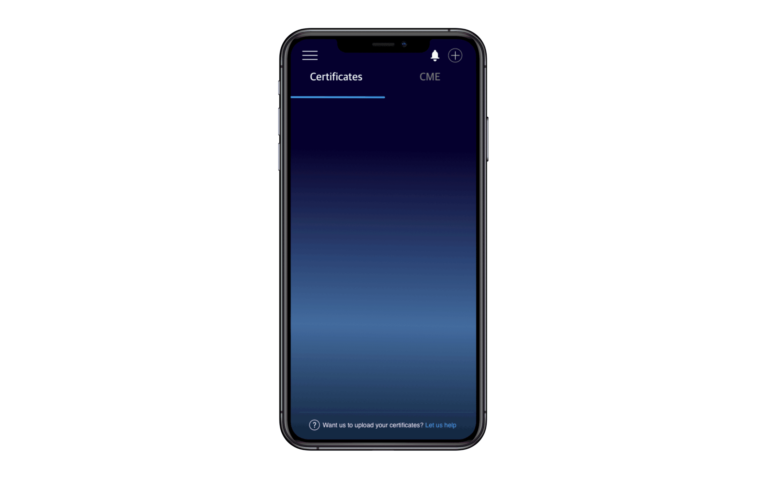
Design Objective: Creating a way for all healthcare professionals to manage their learning and career development activities in one place, so that they may see a overview of their professional profile and be able to manage it with little to no friction.
Tools Used: Sketch, Zeplin, Figma, Anima, Teams, Trello, Invision, Adobe Photoshop, Adobe Illustrator, Mailchimp
Areas discussed in this case study:

The Problem
Healthcare professionals have a lot of documents that they need handy and must be regularly updated in order for them to practice. The area is too segmented and a unified ecosystem does not exist.
• How we can make Healthcare worker’s lives more organized and help them increase efficiency by:
• Giving them a platform where they can view, share all their documents
• Providing Learning resources

The Process Used
We used an iterative product development method, merging the process of agile product development and lean UX, making UX designers apart of the core scrum team which helped technology and design teams collaborate in a more hands on method. We held sprint planning sessions & daily sprints which helped track the progress we were making. Held bi-weekly meetings to discuss/review the product roadmaps.

Research.
Areas Covered:
Business Interviews
User Research
Business Interviews.
Conducted business interviews with the CEO, the operations team, the business development team and other key stakeholders. Once I understood the business space and client goals, I was ready to use the user research to inform our design decisions.
Since the key stakeholders and CEO belonged to a set of the user cohort, their detailed explanation and walk through the current process helped me identify friction points and create initial hypothesis:
Users need their regulatory licenses updated in order to comply with hospital regulations
Users need to take a convenient way to learn online in order for them to be easily certified
User Research.
The Product designer and I worked together to understand the key trends and how we can use that data to inform our design.
The interviews took part in March 2020 and I was able to go through the research and notes and understand the user needs and how they felt about the current process.
Problem Statement.
How might we minimize the pain and time spent by Healthcare Professionals when they apply for a certification or study to complete one and introduce functions that could further shorten their workflow and how might we help them stay organized with all of their documentation.

Define.
Areas Covered:
Key Trends
Solution
Feature Prioritization
Sketches + Wireframes
Key Trends.
Using the data from the user interviews, we were able to synthesize it and identify key trends.
Trend 1
Healthcare Practitioners find themselves bogged down by regulatory and licensure requirements as well as administrative tasks often. Some HPS are provided support by their workplace, while others are even supported by their spouse to keep up.
Trend 2
Healthcare Practitioners would like to become more organized in theory, however; in reality they are unlikely to make the effort required to do so.
Trend 3
Healthcare providers reply on a variety of fragmented individual solutions for their learning, training, storage and tracking needs, for example: various subscription-based websites, conferences, hospital administrative office etc.
Solution.
Using the research we created a persona so we could keep our target audience in mind while designing the appropriate solution that would serve their needs:
User’s Primary Motivation:
The primary motivation of user’s is to be organized and find everything in one place so it is easier to keep track of their regulatory requirements and credits.
This helped define a solution to the problem statement.
Problem Statement: How can we minimize the pain and time spent by Healthcare Professionals when they apply for a certification or study to complete one and introduce functions that could further shorten their workflow and how can we help them stay organized with all of their documentation.
Solution: Offer a convenient online learning and certification process for healthcare professionals to keep up to date on their certifications and CMEs. Empower them by giving them control of what they choose to add to track, learn and make it simple for them to take out outdated documents. Communicate upcoming expiration dates clearly and use encouraging microcopy and UX writing to ensure first-time users can navigate easily. Reduce friction to adoption by creating an optimal and intuitive user flow.
Feature Prioritization.

This image is blurred on purpose as the information it contains is confidential.
Using the MoSCoW prioritization technique we defined the features along with the product manager and product designer and business stakeholders. Each prioritized feature would then become apart of the sprint planning.
Sketches & Wireframes.
The information architecture helped to think through the user flows and I worked on how to simplify the flow.
There was incredible time pressure on our product team as we worked within the core scrum team and as we were coordinated remotely using paper sketches, initially, later held white boarding & live brainstorming sessions using FigJam, Teams & Miro.
As Lead UX, I worked with the Product Owner and Product Manager to list out the important functions and features of our solution such as medical license expiry tracking, certificate management.

Design.
Areas Covered:
Branding / Brand Book
Visual Design + Illustrations
Hi-fidelity designs
Prototypes

Brand Book.
As medtigo grew its user base and as a company, there was a need to synthesize and formalize their branding that would help them with this growth and communicate the brand heart (Vision, Mission, Purpose and Value), brand design guidelines, distinct features and standards to ensure consistency across marketing and design teams and to help it’s users form an association with its products and create a brand identity.
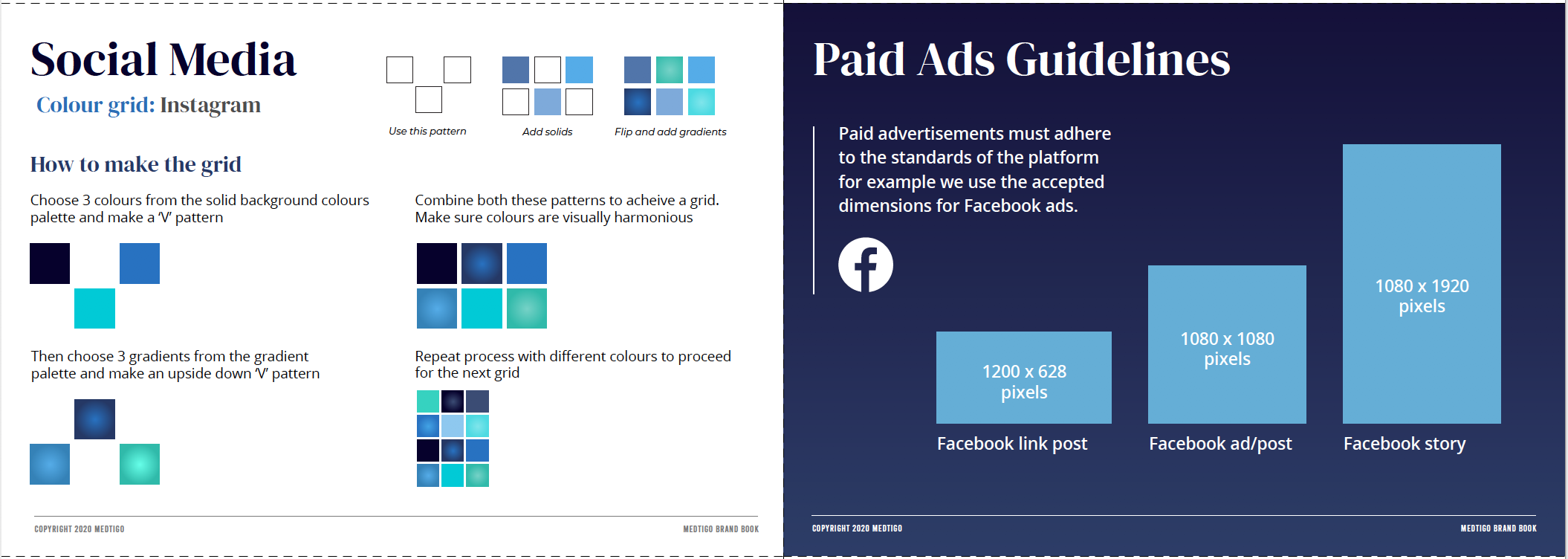
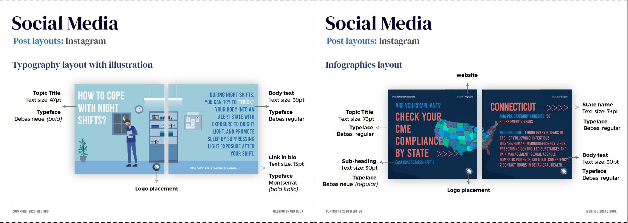
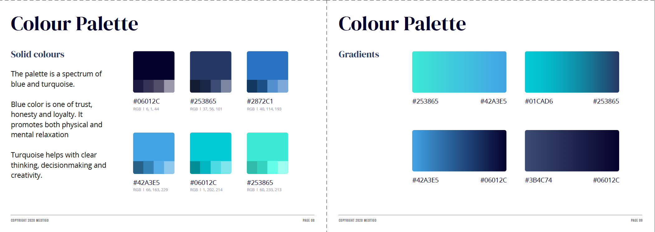
The branding conveyed the tone and language of all design elements, micro copy and marketing material. The colour palette was a spectrum of blue and turquoise to reflect trust, honesty and loyalty. We later removed turquoise from all of the guidelines that used it as font colours because it was not within the web accessibility guidelines.
The branding included the reflection of the brand across social media channels and email marketing assets and messaging.

Visual Design.
Design Exploration.
Using the data to inform our designs, we created mid-fidelity designs and iterated to reduce steps within the user flow and strip any complicated functions that would confuse the user. It took multiple iterations to finally find a flow that was simple and included all data required.
During the sketching phase colours were allocated to each of the expiration states to give the user a visual cue in addition to a written and hierarchal one, for the one of the main features, the tracker.


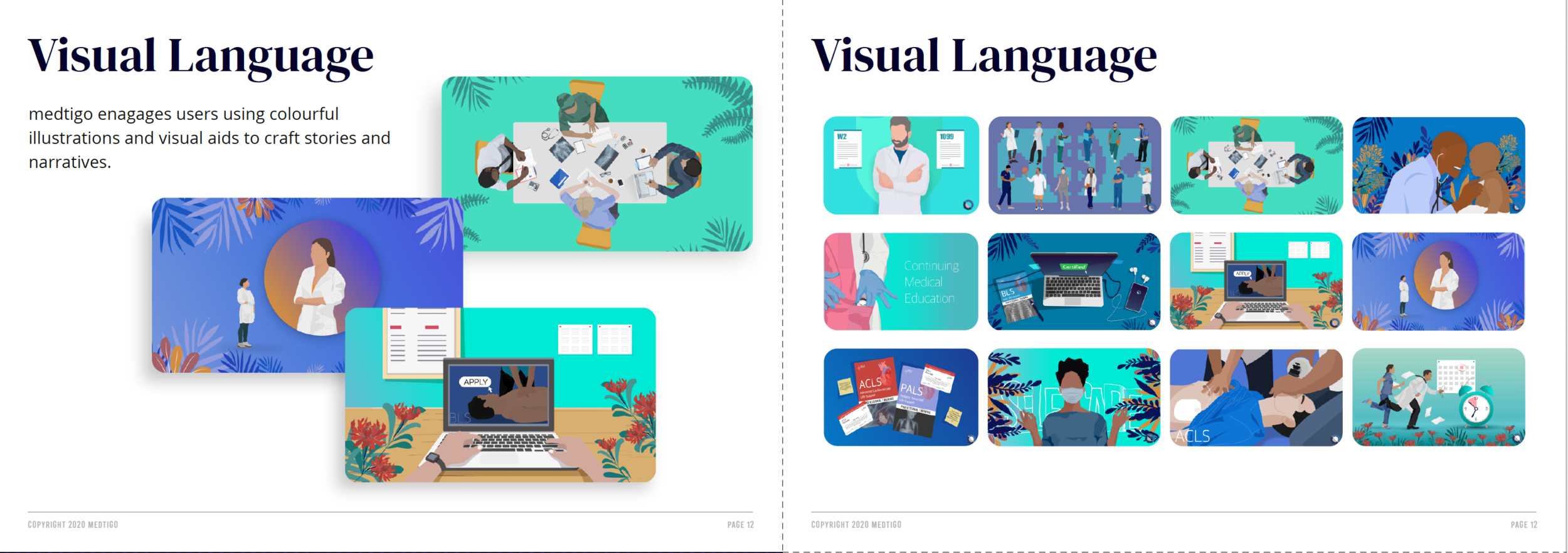
Illustrations.
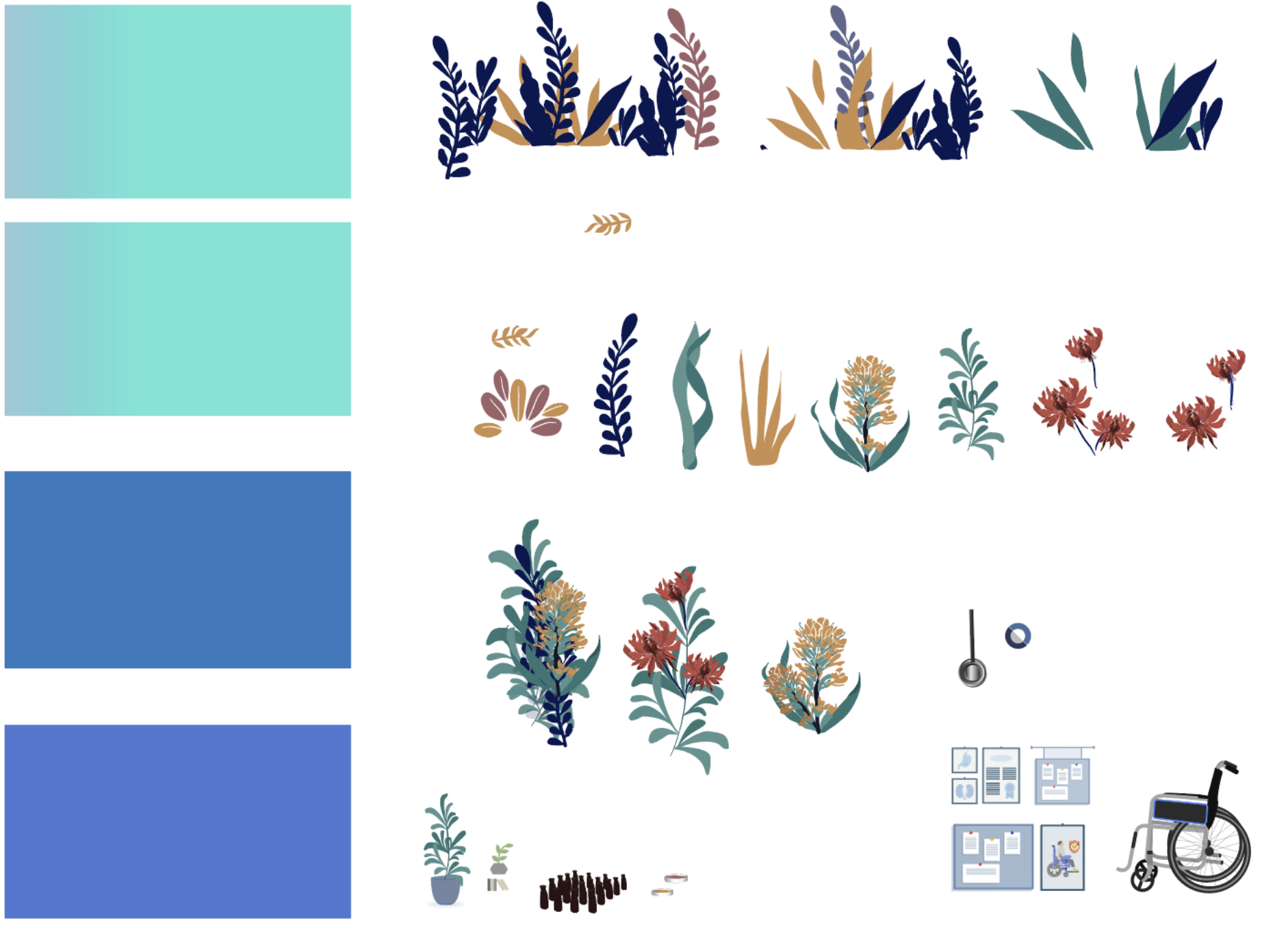
I defined the mood and colours for the custom illustrations that we would create. These illustrations would become an integral part of the brand identity for the company. I guided and worked with illustrators to set the visual identity for the custom illustrations, we predefined and created elements that would be reused in them.

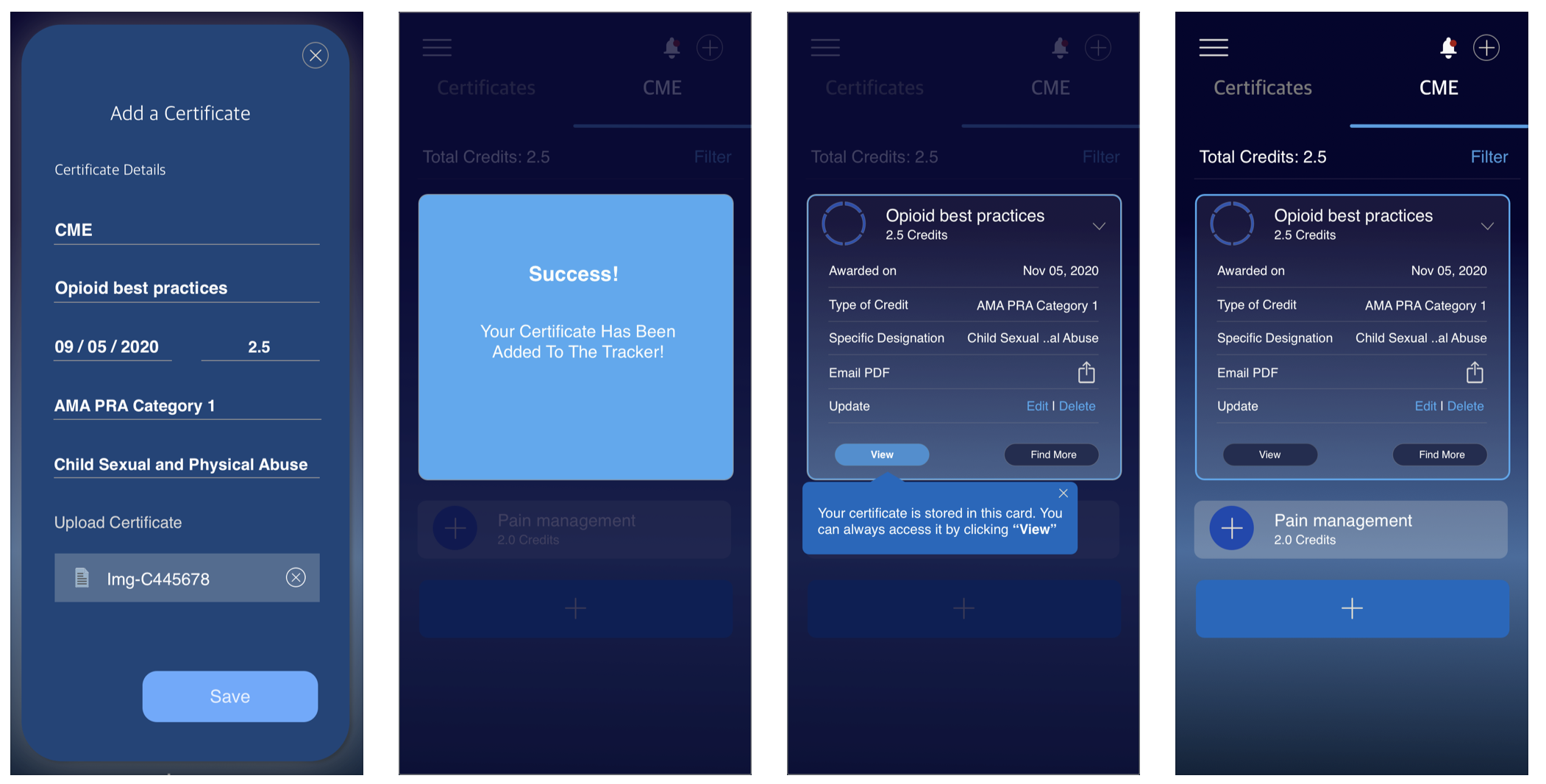
Hi-fidelity Designs.
Being the Lead UI designer on the project, I created Hi Fidelity designs using our wireframes. I used Sketch to create our final solution. I was the one in-charge of creating the UI for all feature screens. Each feature was extensive, in terms of the number of flows and UI elements that had to be created. Managing 2-3 features initially on one sketch file was working but as we progressed I decided to create a file for each of the features we worked on, as this helped me contain the number of screens especially as we moved towards the responsive web app. To keep consistency and to adhere to guidelines I would reuse elements. As our team has now expanded we are working towards creating a design system that will help with faster development, collaboration and make onboarding of new designers easier.
We took a mobile first approach when designing for the web app and to keep the experience consistent we reused UI elements from the native mobile app. One of the challenges that I faced as the sole UI designer was working simultaneously on web and native app features, especially as my responsibility increased as Lead during the course of this project. We managed this by bringing on other UI/UX designers on the team and moving our project from sketch to figma for better collaboration.


Deploy.
Areas Covered:
Style guide
Hand-off Documentation

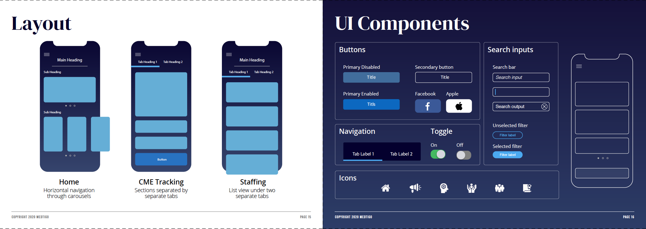
Style Guide.
As our team expanded, we formalized the UI assets so that components could be reused, consistent, and to increase efficiency and collaboration amongst the UX/UI team. We still continue to refine this document and use it internally and are close to having a first version published as the first step towards a formal design system.

Hand-off Documentation.
Design hand-off was done using Figma and Zeplin to allow optimal collaboration with my development team.The hand-off documentation was a detailed document which outlined the business requirements for each of the feature user flows , had links to source files and any interactive prototypes as well as user stories. The cloud document also helped us iterate designs easily as we conducted usability tests and incase there were any technology constraints.
Measure + Grow.
Areas Covered:
Measure
Product Growth

Measure.
I coordinated with in-house Business Intelligence teams and guided them to visually display the data and used the data to measure the impact of our design and leveraged these data points as well as user feedback to make needed iterations.
In order to study user retention by cohorts, I collaborated with the BI team to brainstorm and understand what data points were at our disposal and how we can use them to show user retention in addition to ways on how we could identify retention periods.The data also helped us observe user behaviour and identify user friction points, this further uncovered product growth and retention opportunities.

Product Growth.
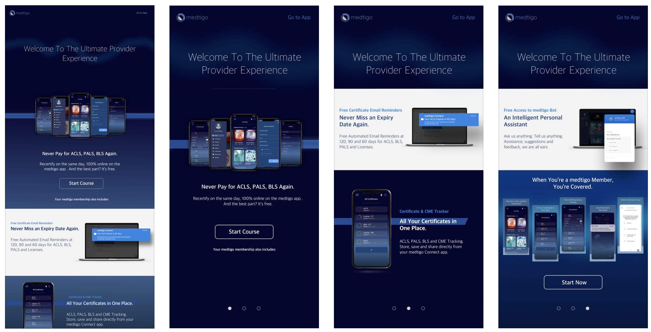
After the MVP launch and once I was able to get data points for the performance, I worked on infusing growth, both within the product and by leveraging other channels like email marketing as well as social channels and making sure that our goals was communicated across company platforms and convergent to achieving one goal: Growth through experienced value.
As the lead UI/UX designer I created strategy decks for retention along with the product designer and led the effort to define subscription based models and how they would aid growth.
Currently there are over 16k app downloads and an NPS score of 58 with 68% of the respondents being promoters.